Viking-era Greenland inspires rPET water bottle concept by Sidel
Canadian Plastics
Packaging Plastics ProcessesThe NUUK brand takes its name from Greenland’s capital and the fjords that make it famous.
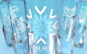
Photo Credit: Sidel
Greenland was settled by Vikings from Iceland in the 10th century, and their reign lasted until sometime in the 15th century, when rapidly cooling temperatures appear to have driven them away.
But their legacy lives on, most recently in the design of a new, 100 per cent recycled PET (rPET) bottle from bottling equipment maker Sidel.
Called the “NUUK” – named for the 10th century Norse capital settlement in Greenland known as Nuuk – the 500-ml bottle concept draws inspiration from what Sidel’s art designers call “the purity of ice and its formations” in Greenland, and is intended as a container for high-quality, fjord-sourced premium water brands.
“The specific ice shape on the lower part of the bottle constitutes a great asset and reinforces its structure – it gives the impression that the bottle is surging up from the ice,” said Laurent Lepoitevin, packaging design engineer at Sidel. In line with its origins, the deep bottle base resembles a rock glacier and is produced by Sidel’s patented Base Over Stroke System (BOSS). The mechanical forming which takes place during the blowing process optimizes the material distribution in the final bottle base profile – the consistent blowing process uses a minimum amount of material; and the wide cap, with its ice shape and blue colour, enhances the brand’s premium look and perception, as does its asymmetric shape.
The bottle is also compatible with tethered cap solutions to meet environmental requirements and forthcoming regulations. “From the base to the bottle cap, the harmonious shape is taken to the next level with a transparent and cleanly designed label,” Lepoitevin said. “The purity of the water can be clearly seen through the elegant and minimal typography, thus emphasizing the bottle’s appearance.” In addition to the water quality and integrity symbolized by the fjords, the use of 100 per cent rPET goes hand in hand with Sidel’s sustainable commitment to achieve closed-loop food grade and recyclable plastic packaging, Lepoitevin added.
The transparent pressure-sensitive label (PSL) decoration is inspired by authentic Viking art – more specifically the Borre style, which embraces a range of geometric interlacing, knot patterns, and single-animal motifs. Five versions of the label show different graphic designs based on this geometric interlacing. The brand logo is a snowflake combined with an ancient Norse symbol, Vegvisir, a symbol of protection and guidance believed to be used as a compass by Vikings. The other labels represent important symbols of Viking culture, including the drakkar ship, two head-to-tail fishes, the Arctic fox, and the polar bear. Consumers can collect each bottle from the NUUK family.
Source: Sidel